missing nabble1 functions in nabble2
missing nabble1 functions in nabble2
|
I just created a mailing list archive and realized it ended up on Nabble2. Honestly, I've been avoiding Nabble2 altogether since its release since it lacks the features from Nabble1 that I really enjoy. So, I thought this would be a great time to ask you to improve Nabble2 ;-).
(Or maybe there are ways to accomplish what I seek already?) 1) Favorite forums Being able to put shortcuts to my favorite forums in the top-right menu in nabble1 is a killer feature IMO. 2) Browsing categories I was trying to find a suitable parent category for my archived mailing list. While maybe not perfect, the nabble1 activity-sorted category browsing usually makes me find a good category quickly, and is also a good way of finding sub-categories or other lists. In nabble2 I just failed in finding anything useful before giving up, maybe because nabble2 is giving less sense of structure? 3) Forum name search Being able to search on category/forum *name*, instead of content, would be nice too, to assist the activity of locating a good parent category. Best regards Mike Wilson |
At (for example) <http://n2.nabble.com/css-discuss-f2038101.html> search for css The answer <http://n2.nabble.com/forum/Search.jtp?forum=2038101&local=y&query=css> defaults to results 'just in css-discuss' but you can pull down to 'All forums' and 'Go' again. A selection of found forums precedes a selection of found messages, then you can 'view all...'. I find > 34 forum matches for css Regards Graham |
|
In reply to this post by Mike Wilson
At (for example) <http://n2.nabble.com/CSS-f2040035.html> where you see > Topics View | People | Options | flag — click the flag icon. Then, wherever you are in Nabble 2, click the flag icon alongside your name — the one at top right. Your flagged forum appears amongst flagged messages. This raises two questions, which I'll post to a separate topic. |
Searching before browsing (a recommendation)
|
In reply to this post by Mike Wilson
I tend to find that beginning with a search (not beginning with a browse) *always* finds what I seek, with amazingly few clicks. |
|
In reply to this post by Graham Perrin
Thanks, I didn't think about the workaround to bookmark individual messages.
I still think this a workaround though, and doesn't get you the user friendliness of the nabble1 solution, so I would still like to ask the Nabble about adding this feature back. Any comments from the Nabble team? |
Re: Searching before browsing (a recommendation)
|
In reply to this post by Graham Perrin
I think this works better in some cases than in others. F ex I was looking for a "Software" category to mirror that category from Nabble1. In Nabble1 it is right at the top of the Active List which tells me this is a commonly used category. On Nabble2, with your tip about looking at forum matches in a search, I do find Software in a list with 300+ forums. Or actually ~30 different instances of a Software category - it is quite evident that other people than me have a problem finding existing categories and create new ones from scratch instead. As long as the system doesn't put the structural info right up in your face, most users will miss it as they are just muddling through (see the web usability book "Don't make me think!"). Nabble1 did a much better job in this respect. Maybe the plan with Nabble2 is to skip the forum categorization and have everything at the top level, and then we'll have to respect that. Though, I quite enjoyed the possibility to discover new forums just by browsing categories on Nabble1 without having to search for a particular subject. |
|
In reply to this post by Mike Wilson
Flagging is not limited to individual messages, not limited to topics; you can flag a forum. |
What's new? = Top Level Forums (ambiguous)
|
In reply to this post by Mike Wilson
<http://n2.nabble.com/> | What's new? | More » presents Top Level Forums <http://n2.nabble.com/freeforums.html> with the top-level 'Software' and 'CSS' forums on page 4. The tail end of that paragraph sounds similar to browsing Top Level Forums, so maybe it's the front page heading 'What's new?' could be worded in a way that's less ambiguous. I can't recall when (if ever) I accepted a Nabble front page invitation to see what's new. With so much on the Internet, 'What's New?' is (to me) not an appealing prospect! YMMV… |
|
In reply to this post by Graham Perrin
Aaah, finally found it! Thanks for your patience ;-)
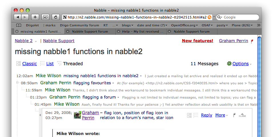
Yet another reflection about web usability is that on Nabble1 I immediately found this feature thanks to the "in my face" menu that says "Favorite Forums" (inner voice: aha, the site supports saving a list of my favorite forums). Again looking in this menu when on a forum page gives me the "Add this Forum" choice. Perfect. On Nabble2 the flag icon appears in different places without an explanation about the difference and is quite small. I didn't even notice the one for the list and for the other two flags my inner voice said: message flag: "this is probably how I flag this message as inappropriate/abuse, I'll stay away from that" user flag: "hum. flag this user as abusive? confused... I'll definitively stay away from that." So, while I think the Nabble1 concept is far far superior, I think the following would be needed to get reasonable usability for the Nabble2 design: * replace flag with star ("starred" items is fairly well-known) * add explanatory title beside flag/star (or at least as tooltip) * move the forum flag/star up and to the right of the forum name Best regards Mike |
Re: What's new? = Top Level Forums (ambiguous)
|
In reply to this post by Graham Perrin
Yes, I tried that listing but instantly gave up. When a forum like "sendawar.c2" with 0 topics is listed on the first page there is not much hope to find anything useful on the following pages. To me, the problem is threefold: * activity doesn't bring the often used stuff to the top * I don't get a sense of category structure ("this match is a forum, but this other match is a category that in turn can be clicked to browse other forums") * the listing shows too few matches per page on too much space |
flag icon, position of flag icon in relation to a forum's name, star icon
|
In reply to this post by Mike Wilson
For messages (probably the most common applciation of flags) AFAIK the placement is consistent: always to the right of the subject of the message. For a forum (probably a less common application of a flag) you're right, the positioning is different. Personally, I never used a flag for a forum. YMMV. I do use my browser, or a bookmarking service, to bookmark fora. The option to ban appears in the 'More' menu and <http://n2.nabble.com/Bug--Banning-users-tp791230p791409.html> explains how "Any user can ban any user". -1 To users of mail clients across the board, the flag icon is probably more familiar than the star. <http://en.wikipedia.org/wiki/Internet_Message_Access_Protocol> In some other environments I favour a star icon but in Nabble, I favour the traditional familiar flag. Maybe. First, I would like to see the flag and other icons explained in help, <http://n2.nabble.com/help/SearchHelp.jtp?query=flag> <http://n2.nabble.com/help/SearchHelp.jtp?query=icon>. +1 to the repositioning, unless Nabble have a good reason for its current placement. Regards Graham |
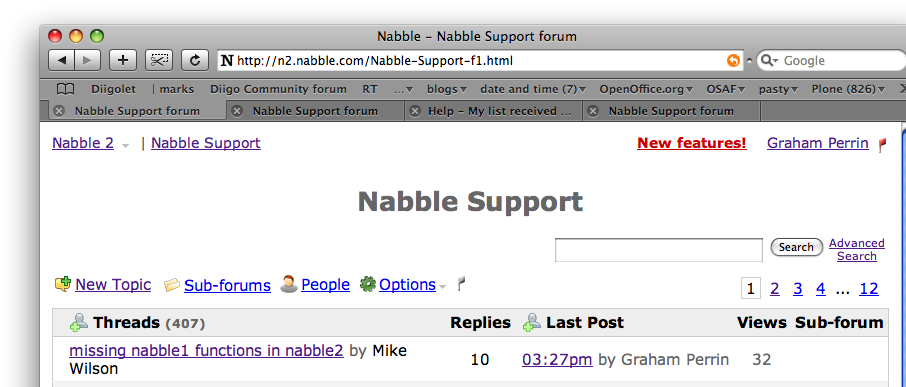
position of forum options (not the flag in isolation) in relation to the forum's table of topics
|
<quote author="Graham Perrin">
I change my +1 to -1 In a (message) context such as this:  — the flag should not be offered for the forum. In a (forum) context such as this:  — the flag should not be separated from other forum-related options — IMHO the best place for these options is where they are, already: immediately above the table of topics. (Options for the forum include 'New Topic' and this certainly belongs at the head of the list of topics.) |
«
Return to Free Support
|
1 view|%1 views
| Free forum by Nabble | Edit this page |

