Distinguish between read and un-read discussions/forums.
12


12
|
Is it possible to distinguish between read and un-read discussions/forums.
Having just settled into our new forum today I'm finding it very frustrating not being able to easily understand which discussions/forums have updated posts since my last visit. Any help with this would be really good. Thanks |
Re: Distinguish between read and un-read discussions/forums.
|
At the topic level:
bold face is a clue to a message being unread. Compare:    I use List and Threaded views more often than Classic. I guess that in Classic view there is comparable hinting. At the forum level: <http://n2.nabble.com/a-new-home-f2115632.html> for example shows the date of the last (most recent) post. Regards Graham |
|
Thanks Graham
So far all members are using classic view because it feels more natural. The most recent topic is always at the top of the list but there is nothing obvious to show whether or not I have read it. What would be really good is a marker against unread topics As below on another forum I use is it obvious that I have read the 3rd and 4th posts but still have to catch up on the others 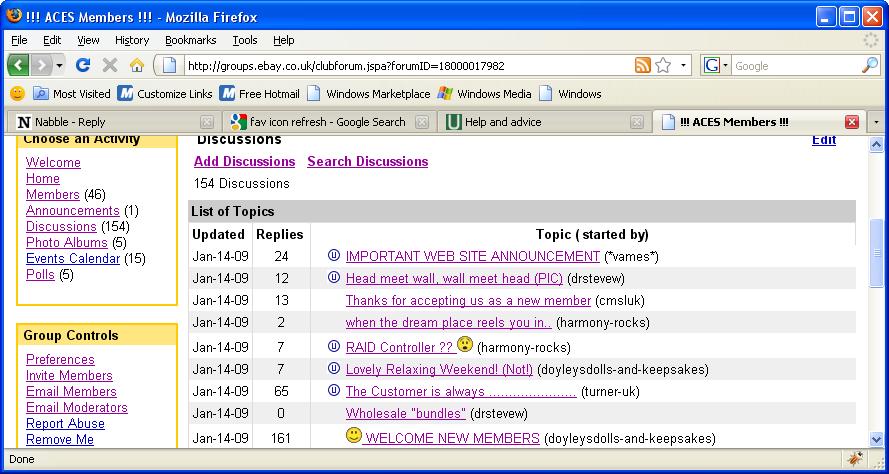
|
Re: Distinguish between read and un-read discussions/forums.
|
Administrator
|
In reply to this post by vames
Sorry, we don't have a dedicated icon for visited vs unvisited, because we simply rely on the change of link color when you click a link. You can tell which thread/forum has been visited before by looking the color of the link, or the color of the link of the last post. Does this work?
We prefer this way because it's something that people already know - you browse sites everyday and most sites don't have a dedicated icon for telling you which links you clicked before, right? With your screenshot, for example, the little "U" icon would hardly make sense to me if I'm not a long time user. Versus, using the link color will make sense to everyone. The limitation is just that if you are accessing the forum from different computers, then there are problems. I use different computers to access our work forum, but it seems very manageable. |
|
Sorry Will but your answer whilst well meaning is just nonsense to me.
From the following screen shot can you tell me which 3 topics have posts I haven't caught up on yet? 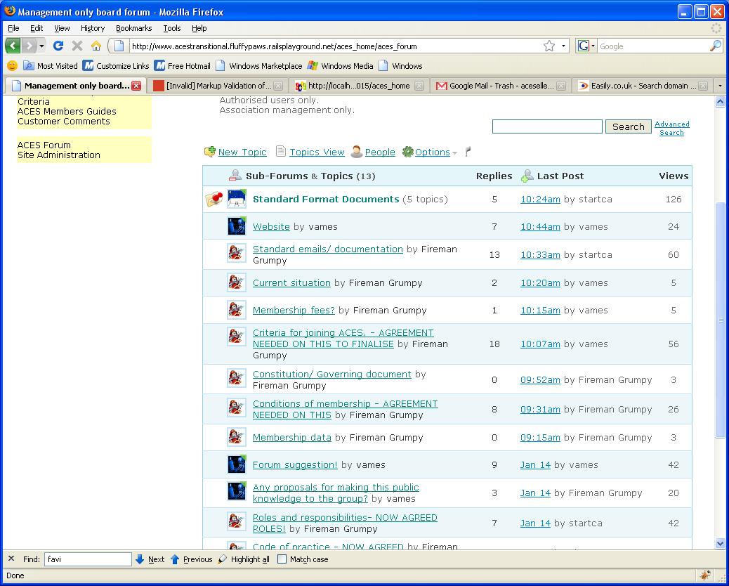 By the time I get back to the forum there will be more. So back to my original question which remains un-answered. Is there a way of determining which topics have been read and which have not because this is getting me extremely frustrated. Thanks James |
|
In the above situation, whilst it would not make any sense to Will to have an icon or some other means of determining read topics it makes perfect sense to me.
Any ideas or help on this would be really appreaciated. James |
Re: Distinguish between read and un-read discussions/forums.
|
Administrator
|
In reply to this post by vames
I just visited your forum, in the public area, here is what I saw:
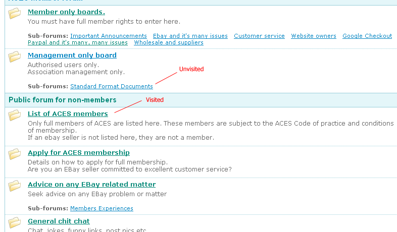 The visited links are green, unvisited are blue. Because both colors are light, so it's a little hard to tell. If you prefer, I can ask Hugo to modify your CSS setting to make the color look more distinctive. The default CSS is more obvious, see: 
|
|
Hi Will.
The problem is deeper than the colour of the link. Can I try to explain a little more clearly You do have a point about the colours and I was going to have a look at changing the visited link colour but this still would not solve the problem! Your first screen shots of our forum with the pointers showing the links that have been visited and the links that have not been visited is the perfect example! The fact is that the "List of ACES members" link shows that it has been visited. It should show as not being visited because there are updated topics in there that I have not visited. If I accepted your arguments that this is all O.K. then you would have to accept the fact that I'm not going to go into that link again because I have read all the discussions. This is totally not true. Today I have logged on after 2 new moderators have joined that are both making the same point and I am faced with 80 new posts in different existing topics and forums and I have not got a clue which ones I have read and which ones I have not So either there is a bug because the link should show as not visited as I KNOW there are messages inside there that have been updated that I have not read OR I NEED an updated discussion icon. How do I know? Because I have just been politely pointed in that direction to respond to a new post. Hope that makes sense! This is a big issue for us. We can not move the other members into this forum until we have a solution So if this is a bug then can we please have a fix to show a link as not visited when anything inside has changed since last visit or could we please have an indicator to show that discussions have been updated since last visited please? A clearer example The first screen shot shows the fact that I have visited the ACES members list The second screen shot shows that when I go into that link there are lots of topics that have not been visited. Therefore the ACES members List link should either be showing as not visited OR it should show as having been updated since last visit. This is even worse with the other forums. In the members only forum I now have not got a clue at all as to what I have read and what I have not because ALL topics are showing as visited but every single one has been updated since I last went into the except 2. Thanks for your replies and here are the screen shots. 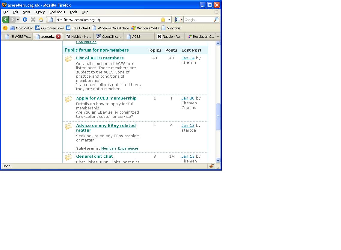 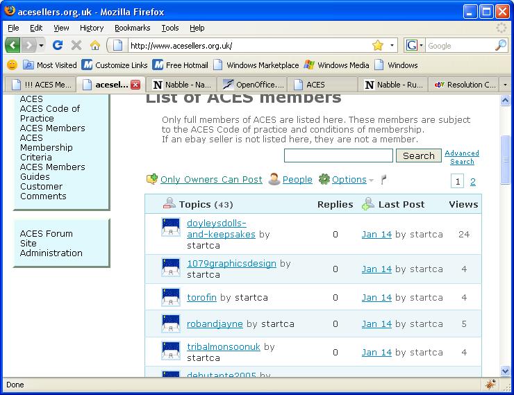
|
|
Another example.
When I came into this forum just now it showed that this topic had been visited. Yet there was no indication at all that it had been updated. It was not at the top of the list and I could not rmember if Will had been the last person to respond. So I had no idea that I NEEDED to visit this topic. Does that make things clearer? Cheers James |
|
Just one last point. Sorry.
It is now clear that there are likely to be over a 1000 posts a day in our forum. We HAVE to have a way of determining which discussions have been read and which have not and which have been updated since last visited. Thanks James |
Re: Distinguish between read and un-read discussions/forums.
|
Administrator
|
James, thanks for keep asking and complaining - your feedback is our best gift.
If I understand you correctly, your point is that: a thread or a forum may show as "visited", but in fact there are new posts/threads in it, which means that there are new stuff in them, and they should be "unvisited", correct? Here is the solution. When you look a thread or a forum, shift your eye to the right, there is always a "Last Post" column. That column has a date/time of the last post in that thread or forum. And the link color follow the same visited-vs-unvisited logic. So, if a thread or a forum has new posts, the color of the link in the "Last Post" cell should just be "unvisited", thus indicating there are new stuff in it. Does this make sense? If you follow every threads closely, you probably will use the "last post" link to enter a thread most of the time. So, that will be where you scan to find if there are new stuff in a thread. |
|
Hi Will
Sorry if this sounds like complaining. It's not intended to be :-) You have understood me correctly. I follow your logic and with that in mind I have had another look. Taking on board your points regarding the last post link showing as "unvisited" I am left with the following point of view. I am still not convinced. The classic view that I'm using makes it intuitive to use the main link rather than the last posted link which is why this is such a problem for us. Using the last posted link to visit discussions is O.K. if you ALWAYS use that link. So when viewing the forum in classic view the proposed solution is both counter intuitive and inconsistent as it requires people to use the classic view in a specific way consistently. If you read back through this discussion the problem becomes obvious. The first responses to my request were informing me of the main link showing as visited and that this should be O.K. and the reat of this discussion has been about how the main links show as visited and how they don't show as visited when you have visited. Gosh, that's a lot of "visiteds" So I end up with the conclusion that this issue is confusing. In my I.T. experience I have to say that when issues like this get confusing it's because the correct solution has not been implemented. Bearing in mind that I find the "classic view" to be the most attractive view for my purposes I can only draw on my experience of usage in other forums that use this view. Sparklit, eBay Community, Rails forum, Aptana Studio community are forums that I use daily. They all without exception implement the same solution for this issue. Some screen shots of how these work The Sparklit forums use a bell icon that is yellow for un-read topics and grey for topics that are read. Personally I find that this is not very clear but it works 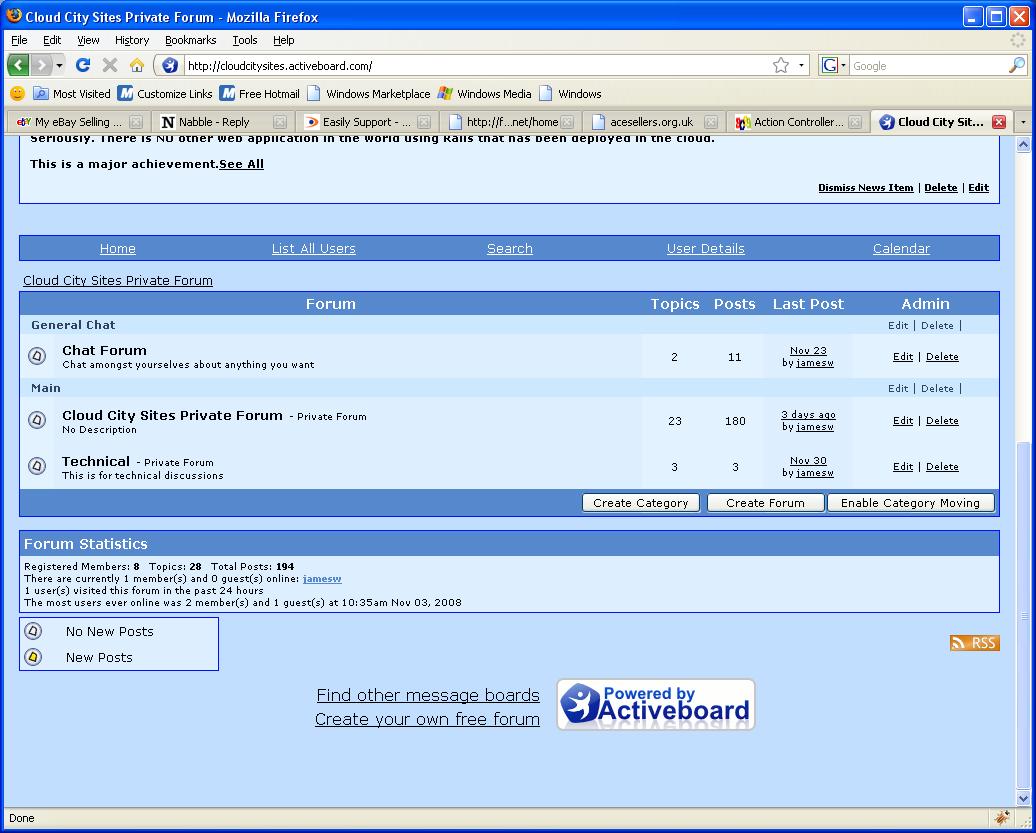 The Aptana studio forums have recently changed their icons and I also find the new Icons to be a pain and it is no longer clear which topics have been read because the icons are so similar 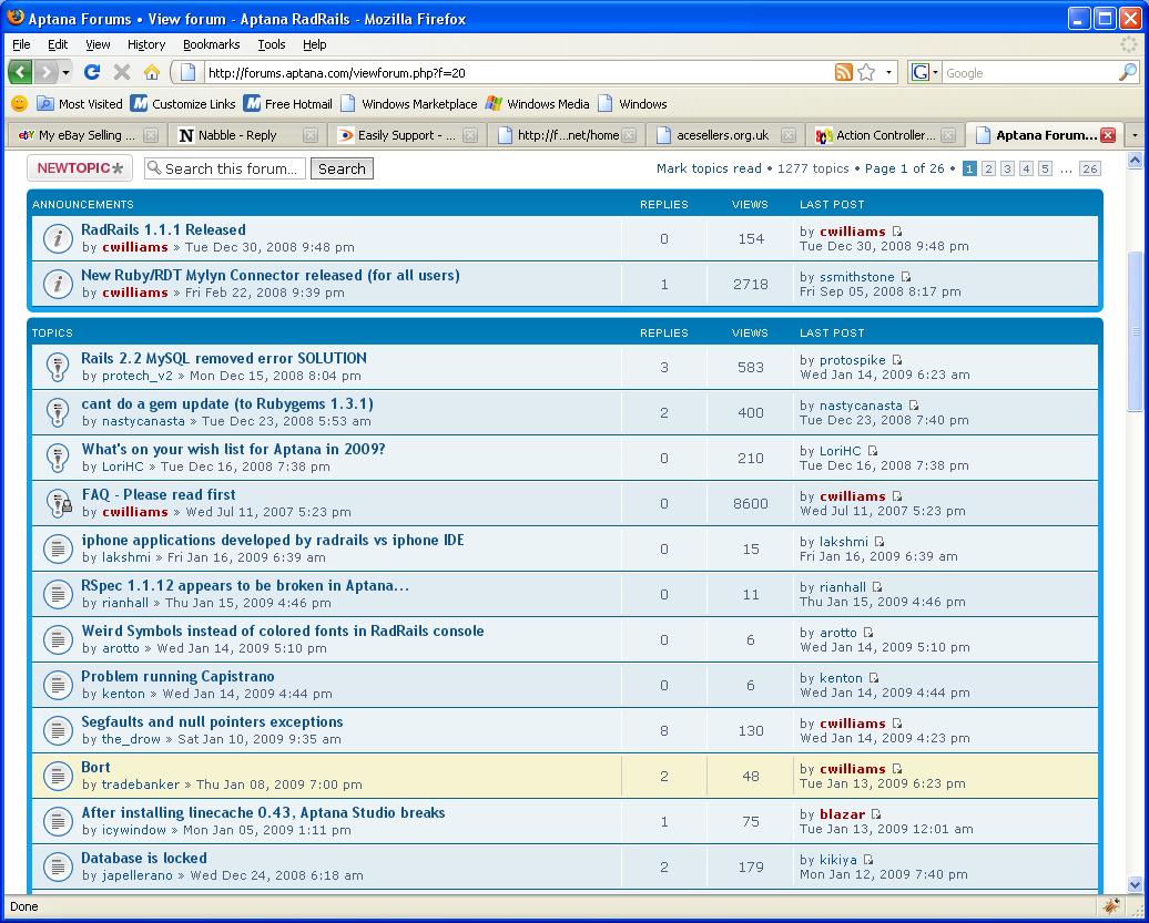 The Rails forum is really good at this. This is done by the main links being set to unvisited if a new has been added since last visit but it also uses a small - sign to show which posts I have contributed to and this is a great feature it's just not obvious enough 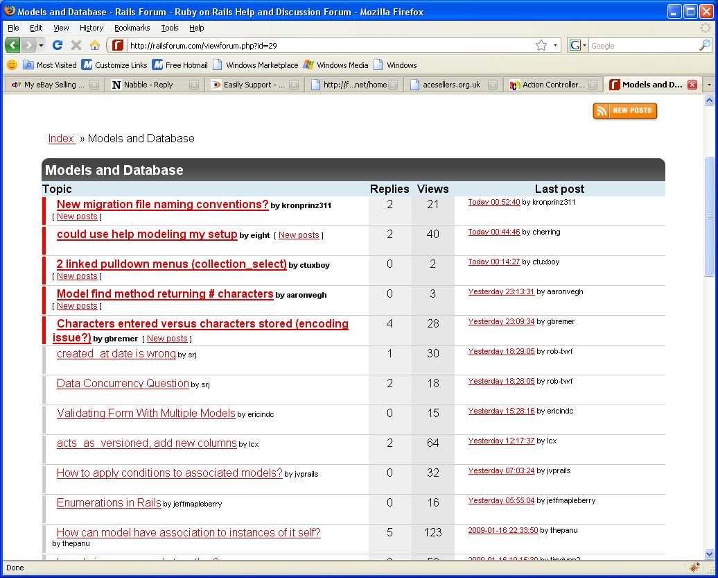 Saving the best 'til last The eBay community forums have it almost spot on. Extremely intuitive and easy to see. They just don't show which topics I have contributed to which is a shame but no big deal 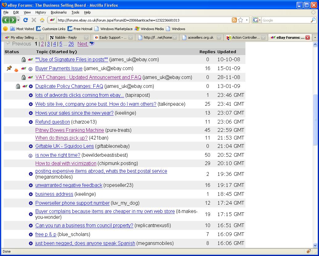 O.K. Now there is one thing I know about software development in business and that is - You don't get a budget to develop features that make no sense Another observation is that organisations like eBay do NOT spend money on ANYTH@ING that they don't have to spend it on. The community is extremely important to them and their business and they have not invested so much time in getting their forum working well without good reason. All this adds up to the fact that regardless of what wnybody thinks these features exist in these forums for VERY good reasons. Now I'm not saying that there isn't a better way of showing discussions and forums as having had new posts since the last time I visited them I just can't think of one (Believe me if I could think of one I'd go and write my own forum) I REALLY LIKE the nabble ethos and what you are doing here but PLEASE come up with a better solution to the ones you have suggesed as laready working because they just don't work for me. I am very comfortable with I.T. but a large percentage of our members are not and the few moderators that we have in the forum at the moment are all finding htis to be a real problem and we all know that this needs to be sorted before we can get the rest of our membership to accept the move that we are making to this forum. I hope I have been able to explain this well enough for you to understand what I mean. Thanks again James |
|
Maybe you guys can come up with something ultra cool that totally blows away all the above solutions to this issue but given a choice I would have a mix of the Rails forum and the eBay forum
The really obvious icons next to the discussion that eBay uses combined with an icon that is equally obvious to show topics that I have responded to would be totally superb You have to remember that I am talking about the "classic view" here as I don't like the list view. The way the list view uses javascript looks really cool but I just can't get in with it in everyday use. I don't know why I don't like the list view yet because I have not given it enough of a chance and if I can work out what it is that is bugging me about this I'll let you know because I know I should LOVE it but I don't. James |
|
Just wondering if you guys have had any more thoughts on this?
Thanks James |
Re: Distinguish between read and un-read discussions/forums.
|
Administrator
|
In reply to this post by vames
Sorry for the delay in getting back to you.
The key thing, seems to me, is how you enter a thread. There are 2 ways, one is to enter from head, the other is to enter from the tail. When I'm new to a thread, I will click the subject to enter from the head. Or if I want to trace the entire thread, I will enter from the head. But when I am participating or following a thread, I will enter mostly from the tail. Because it saves me the seeking time. Is this reasonable? In this scenario, the subject link is the first place to watch, for quickies. But the "last post" link color is the real indicator. This isn't so different from ebay's using an extra icon to indicate if a thread has new posts in it. Seems to me, this doesn't work for you because you rarely enter a thread from the tail. Am I understanding it correctly? |
|
Hi,
Thanks for responding. Seems to me, this doesn't work for you because you rarely enter a thread from the tail. Am I understanding it correctly? Fr That's pretty much it. It shouldn't matter how I enter a thread. Consistency is the key here. I like that different viewing styles can be used and members are free to use the forum in whatever way they feel is best for them. If there was a BETTER way of showing which discussions were new and which have been updated and this was consistent for whatever means are used to access a discussion then I think everyone would be happy. The first reply I had to this discussion stated that the main link would show whuch discussions have been visited and that is clearly wrong because in my opinion if a topic has been updated then I haven't visited it. Also viewing only the tail isn't the solution either. I may have visited a thread yesterday that had 15 discussions in it. Today there may be 50 discussions. So I'm not going to start at the bottom and work my way up. Some forums have a nice feature where you only see the updated posts in a previously visited thread but with a refresh you can see the whole discussion. This is likely to be a VERY busy forum and with only a handfull of members in it at the moment everyone is finding it awkward to keep up. Important posts are being missed and we have started the "office move" announcements to our main membership this morning so it's going to be pretty hairy starting next week. I'm not suggesting that there isn't a better solution than the logo idea but I can't think of one. If you can come up with something else that is really effective pretty quickly I would be most grateful. I'm happy to help in any way I can Thanks James |
Re: Distinguish between read and un-read discussions/forums.
|
Administrator
|
Well, if you had already read 40 posts, then it's better to start from the bottom of the 50, right? I think we are both right in our preferences. But I just thought of a solution which may work for both of us. Suppose a thread has 50 posts in it, we can show the pagination in the subject link. like this: This is a long thread with many posts! (1, 2, 3, 4, 5) The change of link color will show exactly which page of the classic view are already visited by you. Does this make sense? |
|
Will,
That makes sense. I'd like to ask the opinion of some of the group members on this and get back to you if that's O.K. This affects all of us not just me and I want to be certain that this is the right idea. Thanks James |
|
O.K. I've gotten to the bottom of the problem.
We are a group of online independant eCommerce traders The nature of eTrading attracts an abnormally high percentage of people that are unable to work in full time jobs due to disabilities of all sorts of types. Because of this we are seeing a larger than average number of problems with the way the forum works in regards to members not being able to distinguish between discussions that have been read and those that have not been. I suspect that the replies I have had in here are from people who are fortunate enough not to suffer with perception issues in the same way that some of our members do and this is more about accessibility than functionality if you understand what I mean. So I am going to change the CSS to make the visited link colours more obvious but I think we also need the icon indicator as well. The following message from one of our members really sums up the issue. Colours are not obvious to me, I liked the N and U on eBay and the blue to white - clear and concise If I have read it and no one else has posted I do not need to re-read it - but I am doing, and this is taking time - which is difficult for me especially at the mo. In an ideal world updated discussions would be easy to see, sorry to sound demanding, but I am very confused as to what I have read and what I havent I hope this has cleared up what is a very difficult problem to describe to those like me who are fortunate enough to not have these problems. Thanks James |
|
Perhaps it would be possible to have an icon option that can be swithched off for forums run by people that are fortunate enough to find it unneccessary?
The option of having the pagination links I think is likely to cause further confusionbut I can see the benefits where maybe others can not so I'm reserving judgment on that one. Cheers James |
«
Return to Free Support
|
1 view|%1 views
| Free forum by Nabble | Edit this page |

