Re: Mobile optimization
Posted by GregChapman on
URL: https://support.nabble.com/Mobile-optimization-tp7594498p7594651.html
Hi Hugo,
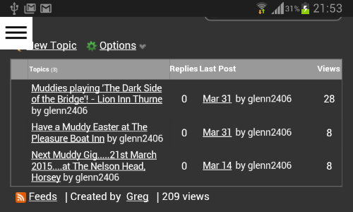
If you look at my images, you'll see that my screen appears a little narrower than yours (or the text bigger in proportion to the width available).
In your first image it doesn't have a major impact. Each topic title text just wraps sooner - and is is better than my first sceenshots.
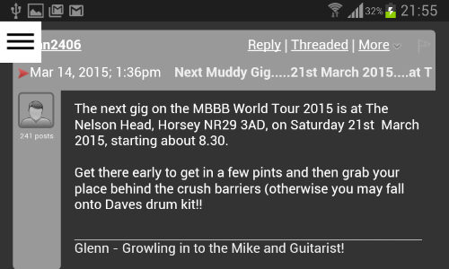
However, in the second image even the relatively short username means there's not enough room for the "Reply-Threaded-More-Report" component and it then slides under the username line and obscures everything bar the "Selected post" marker or first two characters of the date.
Perhaps the date line just needs a "clear: right;" rule? But if it's not as simple as that then I guess it's down to a decision on whether the Galaxy S3 Mini and its 800x480 screen is too far below the norm to chase down a solution, especially given that in landscape mode there's adequate space, for any normal length of username:
I thought that, this morning, I did wait long enough for the flashing tab icon to stop flashing on page reload. However, I can now confirm that after two or three flashes the icon does go steady, seemingly confirming you have fixed the issue with constant reload.
[Probably Irrelevant Aside: I don't fully understand how the meta tag
URL: https://support.nabble.com/Mobile-optimization-tp7594498p7594651.html
Hi Hugo,
If you look at my images, you'll see that my screen appears a little narrower than yours (or the text bigger in proportion to the width available).
In your first image it doesn't have a major impact. Each topic title text just wraps sooner - and is is better than my first sceenshots.
However, in the second image even the relatively short username means there's not enough room for the "Reply-Threaded-More-Report" component and it then slides under the username line and obscures everything bar the "Selected post" marker or first two characters of the date.
Perhaps the date line just needs a "clear: right;" rule? But if it's not as simple as that then I guess it's down to a decision on whether the Galaxy S3 Mini and its 800x480 screen is too far below the norm to chase down a solution, especially given that in landscape mode there's adequate space, for any normal length of username:
I thought that, this morning, I did wait long enough for the flashing tab icon to stop flashing on page reload. However, I can now confirm that after two or three flashes the icon does go steady, seemingly confirming you have fixed the issue with constant reload.
[Probably Irrelevant Aside: I don't fully understand how the meta tag
<meta name="viewport" content="width=device-width, initial-scale=1">works. Maybe I should do as some advise and dispense with the recommended "initial-scale=1". My tablet, which has a 1440x900 screen, shows the full "desktop site" in landscape mode, complete with its conventional horizontal menu bar. The CSS tells the browser to switch to the three bar "menu button" when the display is 640px or less, yet my phone retains the menu button in landscape mode and my tablet shows in it portrait mode, when both are above the 640px limit!]
Volunteer Helper - but recommending that users move off the platform!
Once the admin for GregHelp now deleted.
Once the admin for GregHelp now deleted.
| Free forum by Nabble | Edit this page |