Re: Google Announcement
Posted by GregChapman on
URL: https://support.nabble.com/Mobile-optimization-tp7594498p7594558.html
Hi Hugo,
Thought I'd chip in on this one in case it is any help, although, I'm probably just teaching you to suck eggs and it's just a matter of a lack of resources to carry it out!
I've just developed my first site, designed to be mobile-friendly according to Google (still at its "test" URL). Here's the link to the page with my forum embedded:
http://www.muddybroadbluesband.co.uk/new/contact.html
And here are screen dumps of that page on my Samsung S3 Mini (native screen: 800x480px - though the tag:

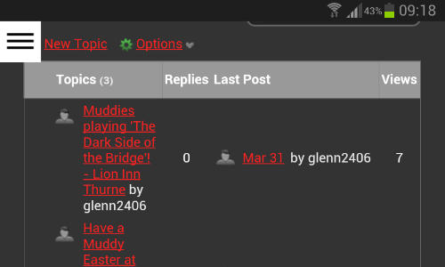
As you see, in portrait orientation, some columns are lost completely and others truncated. In landscape mode you can see all columns, but the proportions of screen space taken by the "Topic" and "Last Post" columns are disproportionate.
As Google suggests, it seems to me that as the screen reduces in size it is imperative to remove certain features of the standard screen. I'd suggest that the order of priority for display is:
Topic Title
Topic Author
Last Post Date
Last Post Author (ideally to have a preceding line break to place it under Last Post Date)
Replies
Views
Topic Author Icon - Last Post Author Icon (These have equal priority - remove or show both)
In terms of implementation it appears the biggest problem is that currently there are insufficient specific functional CSS classes in your code. Instead it is stuffed with generic visual classes (e.g. "nowrap", "no-decoration", "light-border-color", "invisible", "weak-color", "medium-border-color", etc) that are used all over the forum so that altering their rules have unwanted impacts everywhere else. This makes it impossible to pick out some of the features I identify that in these circumstances need a "display: none" CSS rule.
The good news is that it should be a simple and quick fix to add the necessary functional classes to identify the various components of the screens above.
One can return at at any later date and begin to merge the code for those generic visual classes into the functional classes and generally implement this throughout the entire Nabble code.
I know I should attempt to do this myself, but experience teaches me I am not skilled enough with NAML code to risk trying it!
It may be worth mentioning that I also have Nabble's "Mobile Friendly" option set ON on the site. It appears to work well. The one oddity is how orientation affects the message creation screen. If you start in portrait mode and switch to landscape, then you need to zoom out. Conversely, if you start in Landscape and switch to portrait, you need to zoom in. Ideally it would be able to switch the zoom factor as you change orientation.
URL: https://support.nabble.com/Mobile-optimization-tp7594498p7594558.html
Hi Hugo,
Thought I'd chip in on this one in case it is any help, although, I'm probably just teaching you to suck eggs and it's just a matter of a lack of resources to carry it out!
I've just developed my first site, designed to be mobile-friendly according to Google (still at its "test" URL). Here's the link to the page with my forum embedded:
http://www.muddybroadbluesband.co.uk/new/contact.html
And here are screen dumps of that page on my Samsung S3 Mini (native screen: 800x480px - though the tag:
<meta name="viewport" content="width=device-width, initial-scale=1">appears to mess with that somewhat!)
As you see, in portrait orientation, some columns are lost completely and others truncated. In landscape mode you can see all columns, but the proportions of screen space taken by the "Topic" and "Last Post" columns are disproportionate.
As Google suggests, it seems to me that as the screen reduces in size it is imperative to remove certain features of the standard screen. I'd suggest that the order of priority for display is:
Topic Title
Topic Author
Last Post Date
Last Post Author (ideally to have a preceding line break to place it under Last Post Date)
Replies
Views
Topic Author Icon - Last Post Author Icon (These have equal priority - remove or show both)
In terms of implementation it appears the biggest problem is that currently there are insufficient specific functional CSS classes in your code. Instead it is stuffed with generic visual classes (e.g. "nowrap", "no-decoration", "light-border-color", "invisible", "weak-color", "medium-border-color", etc) that are used all over the forum so that altering their rules have unwanted impacts everywhere else. This makes it impossible to pick out some of the features I identify that in these circumstances need a "display: none" CSS rule.
The good news is that it should be a simple and quick fix to add the necessary functional classes to identify the various components of the screens above.
One can return at at any later date and begin to merge the code for those generic visual classes into the functional classes and generally implement this throughout the entire Nabble code.
I know I should attempt to do this myself, but experience teaches me I am not skilled enough with NAML code to risk trying it!
It may be worth mentioning that I also have Nabble's "Mobile Friendly" option set ON on the site. It appears to work well. The one oddity is how orientation affects the message creation screen. If you start in portrait mode and switch to landscape, then you need to zoom out. Conversely, if you start in Landscape and switch to portrait, you need to zoom in. Ideally it would be able to switch the zoom factor as you change orientation.
Volunteer Helper - but recommending that users move off the platform!
Once the admin for GregHelp now deleted.
Once the admin for GregHelp now deleted.
| Free forum by Nabble | Edit this page |