Highlighting
Posted by Graham Perrin on
URL: https://support.nabble.com/Highlighting-tp2295916.html
A few days ago I thought I had stumbled upon a new Nabble approach to highlighting some types of message:
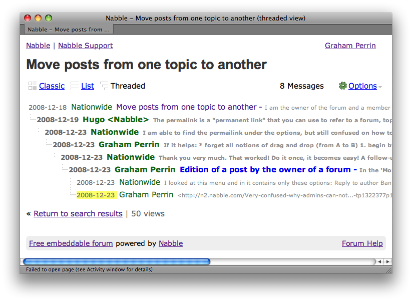
Then I realised that the misplaced highlights were the result of pages not entirely loaded:
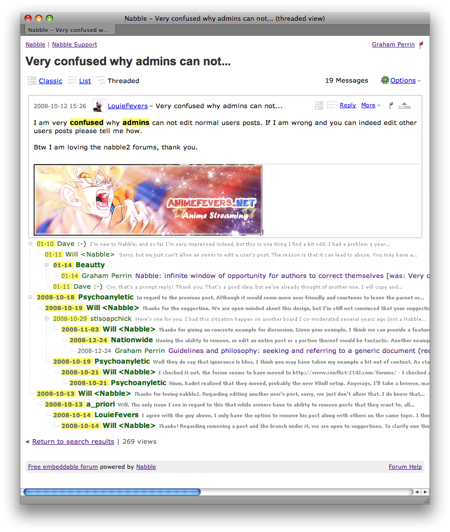
Here's how the highlights, which relate to a search string, should appear:
The accidental placement of the highlights was thought provoking, coinciding with this topic.
I do like a highlight on the date. I do like toggling at far left. A few thoughts, pros and cons:
1. reduces my confusion when chronologies are mixed-up in threaded view (YMMV)
2. clicks towards the left draw attention to the subtree shift feature (before this coincidence, I never realised that the sidebar had any function)
3. the CLOSE feature at extreme right is, from a Mac perspective, on the wrong side
4. toggling at extreme left is more akin to disclosing/closing in Finder list view and in Windows Explorer
5. a slight down side: second and subsequent clicks on the same point (without moving the mouse) are not perfect toggles (disclose/close); appearance of the sidebar shifts the date etc. a few pixels to the right.
If that glitch (5) could be overcome, then I would enjoy
• highlights (for logged in users only) drawing attention to un-read topics and messages
• only when search highlighting is not effective.
In the future I might spin this off to become an RFE. An option, not a default (I wouldn't expect everyone to enjoy highlights) .For the moment it's more, a note to self.
Regards
Graham
URL: https://support.nabble.com/Highlighting-tp2295916.html
A few days ago I thought I had stumbled upon a new Nabble approach to highlighting some types of message:
Then I realised that the misplaced highlights were the result of pages not entirely loaded:
Here's how the highlights, which relate to a search string, should appear:
The accidental placement of the highlights was thought provoking, coinciding with this topic.
I do like a highlight on the date. I do like toggling at far left. A few thoughts, pros and cons:
1. reduces my confusion when chronologies are mixed-up in threaded view (YMMV)
2. clicks towards the left draw attention to the subtree shift feature (before this coincidence, I never realised that the sidebar had any function)
3. the CLOSE feature at extreme right is, from a Mac perspective, on the wrong side
4. toggling at extreme left is more akin to disclosing/closing in Finder list view and in Windows Explorer
5. a slight down side: second and subsequent clicks on the same point (without moving the mouse) are not perfect toggles (disclose/close); appearance of the sidebar shifts the date etc. a few pixels to the right.
If that glitch (5) could be overcome, then I would enjoy
• highlights (for logged in users only) drawing attention to un-read topics and messages
• only when search highlighting is not effective.
In the future I might spin this off to become an RFE. An option, not a default (I wouldn't expect everyone to enjoy highlights) .For the moment it's more, a note to self.
Regards
Graham
| Free forum by Nabble | Edit this page |