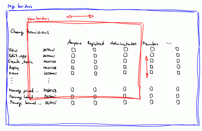
options page for "change permissions" unpractically big
|
Hi,
my newly installed forum site uses several groups and subforums. In order to keep everything organized and "protected" against external posters, every group has a different permissions setting regarding each subforum on the site. Through the options menu, the group permissions regarding each subforum can be set. DESCRIPTION Please see the sketch below to understand what I mean:  Even though, the view borders can be adjusted using the sliders on the right and below the screen (screen borders in red color), the whole options page can never bee seen as a whole when having a couple of groups and many options (options page borders in blue color). Either you can not see the options (situated on the left of the page) when figuring out the permissions for a group situated on the right of the page, or you can not adjust the group permissions while seeing the options. And you can never compare the permission settings for your groups as a whole, because the spaces between the tick boxes are too big to fit into the view. QUESTION Is there a way to cope with big permissions options pages? In order to compare the settings for all the groups, it would be convenient to at least permanently see the option names while browsing through the groups (e.g. by keeping the two left columns fixed and scroll through the groups). Another possibility would be to tilt the group titles by 90 degrees anti-clockwise in order to minimize the space between the tick boxes and thus fit more groups into one view. Are there some possibilities to gain a better overview (without having to rename the groups to "A", "B" and "C"...)? Thanks |
Re: options page for "change permissions" unpractically big
|
There's no easy answer to this one, other than the use of your browser's zoom control.
For example (using the keys on the top right of the main typing area) try: CTRL-+ = Zoom in CTRL-- = Zoom out CTRL-0 = Reset zoom Works in most browsers! (Typically browsers will store the zoom setting for any site you visit. Very useful for sites you find difficult to read at the default text size. An oldie like me uses the function all the time!) Beyond that you'll need to try some heavyweight hacking of NAML code or styling of the HTML tag
«
Return to Free Support
|
1 view|%1 views
|

