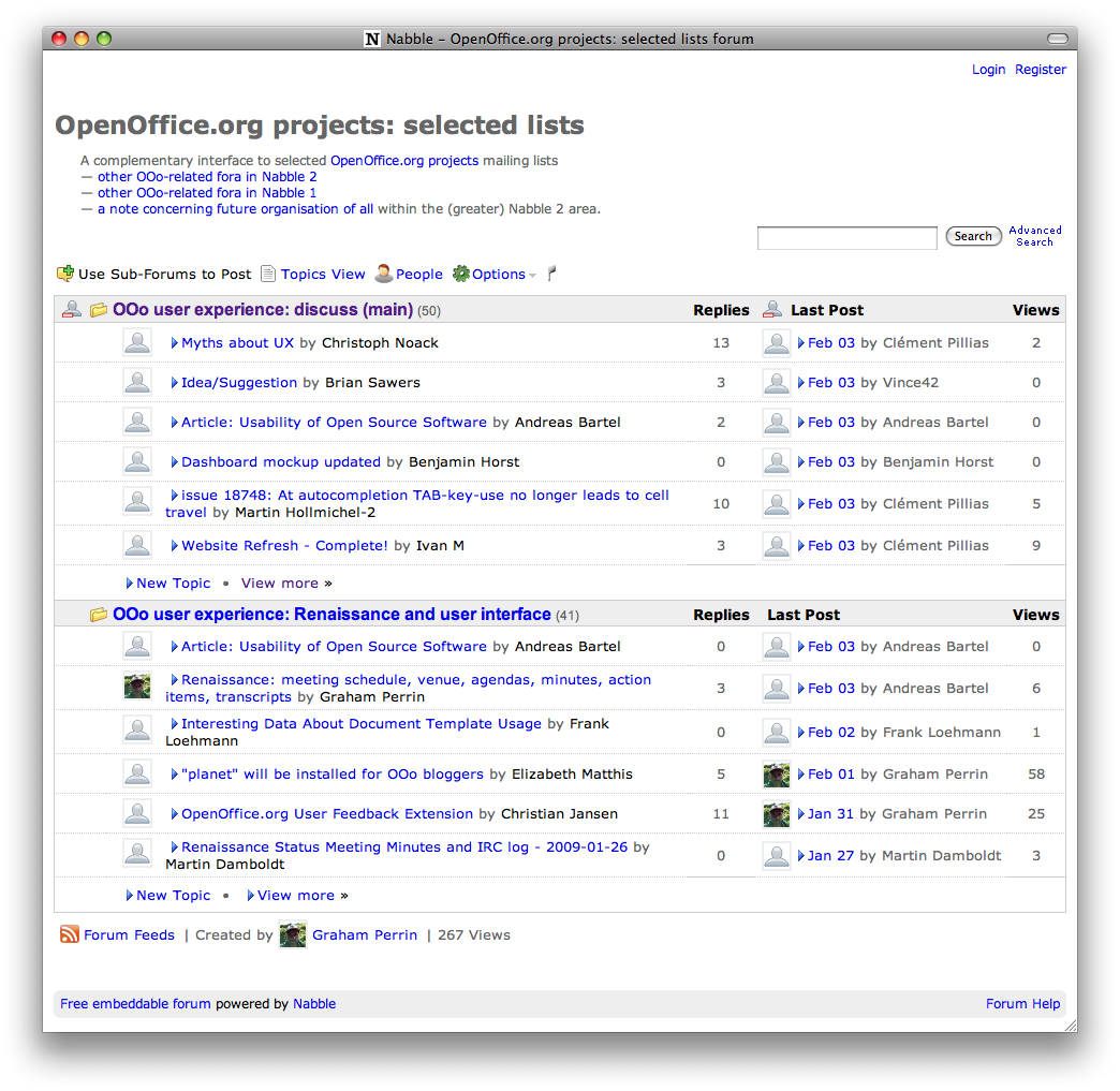
Personally, I like the blue arrows drawing attention to messages that I have not read.
Unselfishly, I consider that most subscribers to lists @ux.openoffice.org are probably
not registered with Nabble. For the majority — for anonymous (non-Nabble) viewers — I would like the view below to be
without the arrows.

First impression to anonymous viewers should be as clean and simple as possible, allowing focus on content and features.
(The blue arrow is thanks to
CSS offered by Nabble.)
Is it possible with CSS to have the blue arrows appear
only to viewers who are both (a)
registered with Nabble and (b)
logged in?
Incidentally this second/third question relating to CSS should be my last :)
TIA
Graham