Newspaper - read more

classic Classic list List threaded Threaded
8 messages Options
Reply | Threaded
Open this post in threaded view
|

Newspaper - read more

darren_ccc
The "read more" link on the "Newspaper" style blog is effecting the font size of the Article when viewed on a mobile device. Its seems to effect most mobile browsers except Dolphin browser for some reason.
Reply | Threaded
Open this post in threaded view
|

Re: Newspaper - read more

GregChapman
Please post the URL. No problem here with any of my news apps on my Android tablet or phone.
Volunteer Helper - but recommending that users move off the platform!
Once the admin for GregHelp now deleted.
Reply | Threaded
Open this post in threaded view
|

RE: Newspaper - read more

darren_ccc

http://crompton.play-cricket.com/subsite/web_pages/235608


From: GregChapman [via Nabble Support] [mailto:[hidden email]]
Sent: 05 October 2014 19:34
To: darren_ccc
Subject: Re: Newspaper - read more


Please post the URL. No problem here with any of my news apps on my Android tablet or phone.

Just a Volunteer Nabble Helper - because the nice folk at Nabble have helped me!


If you reply to this email, your message will be added to the discussion below:

http://support.nabble.com/Newspaper-read-more-tp7591797p7591800.html

To unsubscribe from Newspaper - read more, click here.
NAML

Reply | Threaded
Open this post in threaded view
|

RE: Newspaper - read more

GregChapman
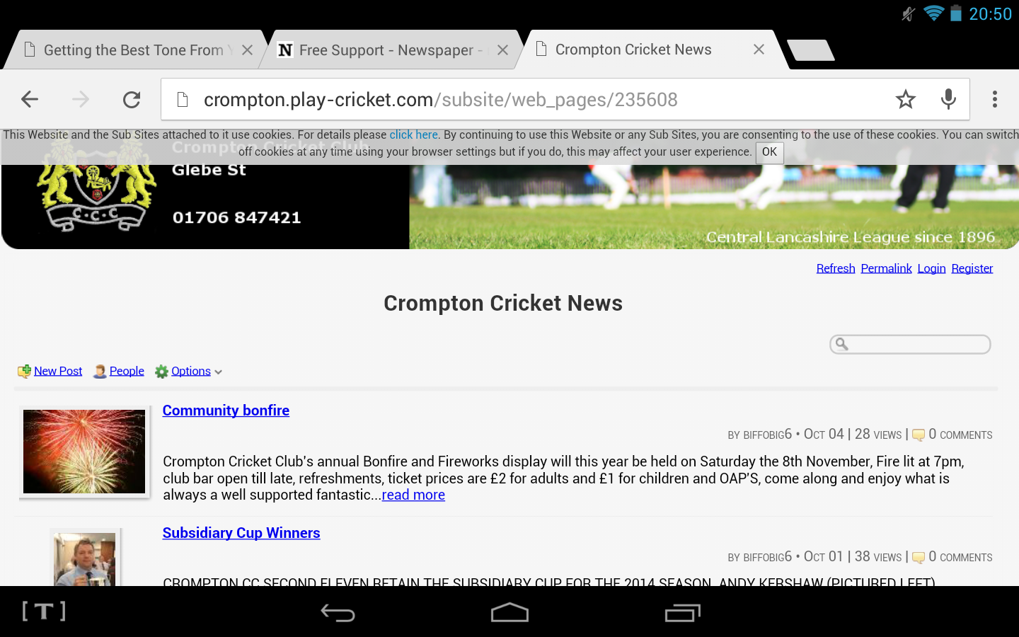
Here's what I am seeing?

On my Galaxy S3 Mini:
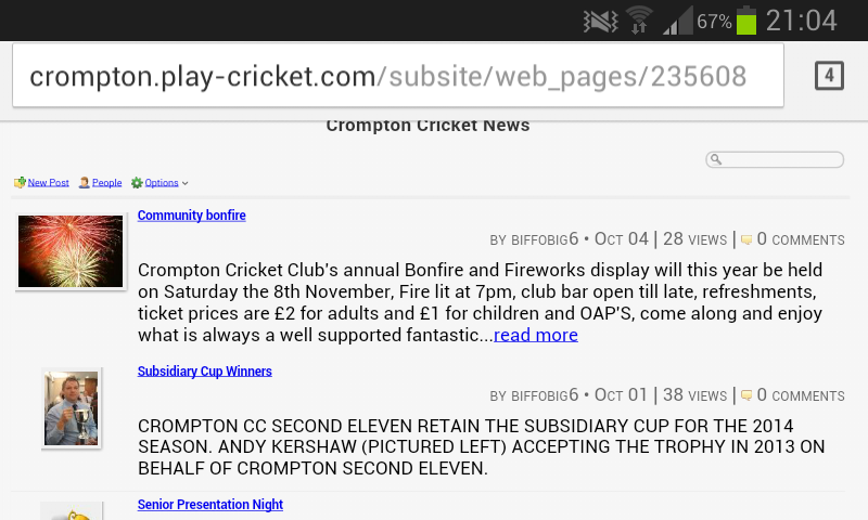
Screenshot S3 Mini

And on my Tesco Hudl:

Screenshot Tesco Hudl

It all seems as with the normal level of differences that I would expect from assorted browsers on my PC.

What do you see and why do you say it's something to do with "Read more..."

Please post your own screen shots to explain more.
Volunteer Helper - but recommending that users move off the platform!
Once the admin for GregHelp now deleted.
Reply | Threaded
Open this post in threaded view
|

Re: Newspaper - read more

darren_ccc
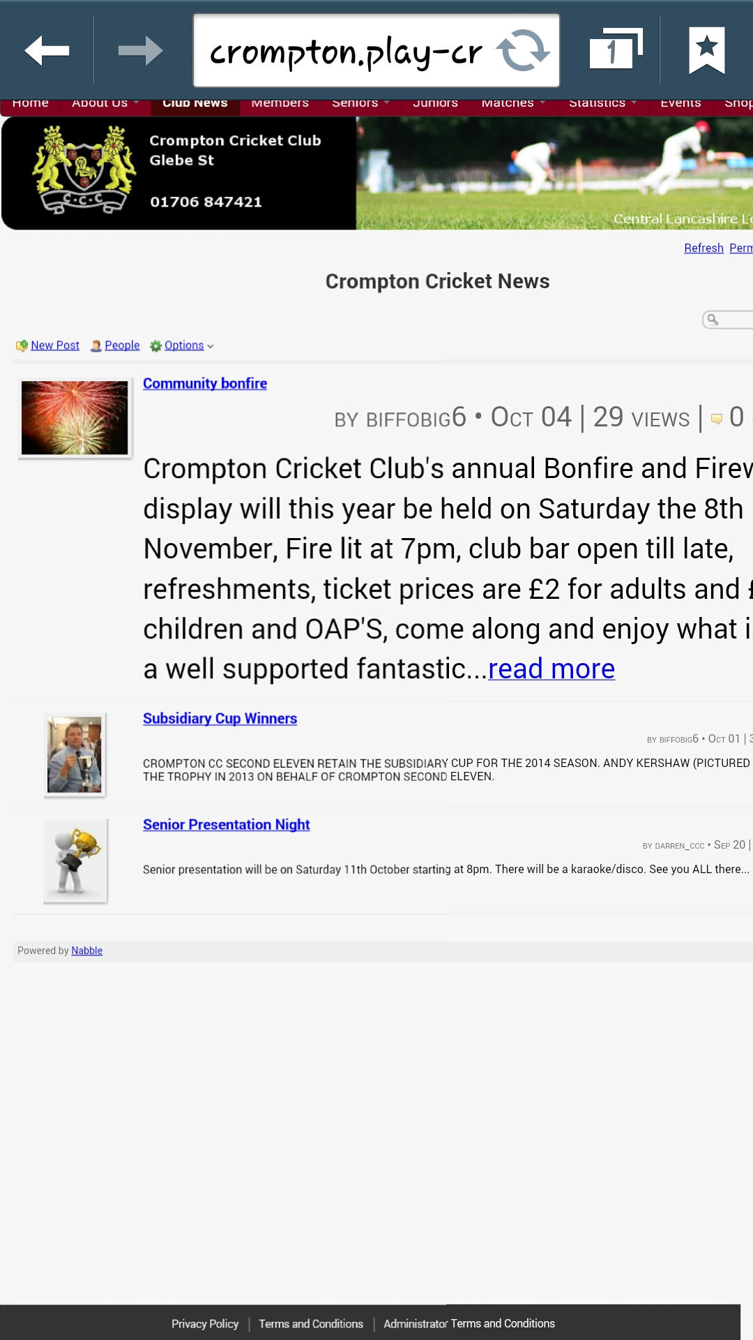
This is the image from my galaxy note 3. The reason I think it's related to the read more function is that it's only occurred when the read more is present.  


Sent from Samsung Mobile


-------- Original message --------
From: "GregChapman [via Nabble Support]"
Date:05/10/2014 21:17 (GMT+00:00)
To: darren_ccc
Subject: RE: Newspaper - read more

Here's what I am seeing?

On my Galaxy S3 Mini:

Screenshot S3 Mini

And on my Tesco Hudl:

Screenshot Tesco Hudl

It all seems as with the normal level of differences that I would expect from assorted browsers on my PC.

What do you see and why do you say it's something to do with "Read more..."

Please post your own screen shots to explain more.
Just a Volunteer Nabble Helper - because the nice folk at Nabble have helped me!


If you reply to this email, your message will be added to the discussion below:
http://support.nabble.com/Newspaper-read-more-tp7591797p7591804.html
To unsubscribe from Newspaper - read more, click here.
NAML

FlashAnnotate.jpg (747K) Download Attachment
Reply | Threaded
Open this post in threaded view
|

Re: Newspaper - read more

darren_ccc
In reply to this post by darren_ccc
Hi again Greg,

I have tried it myself on the galaxy Samsung mini 3 and the iphone 4 and all appears ok, so it must be related to my galaxy note 3 somehow. Typical! Thanks for getting back so soon. It just seemed strange that only the dolphin browser worked fine on my phone.
Reply | Threaded
Open this post in threaded view
|

Re: Newspaper - read more

GregChapman
I think this is less to do with the "Read more..." and more related to the styling code that applies in News apps that affects the article heading.

I'd be intrigued to see how a couple of my News apps appear on the "Note 3". Can you take a look at:

http://www.rustonreaches.co.uk/blog.html
http://www.gregafloat.org.uk/blog/index.html

(Ignore the fact I refer to them as "blogs".)

The following is more directed at Pedro as he might be able to amend things to provide a more consistent display across more browsers.

There are a number of features of Nabble's code that appear to be less than optimal and relate to the size and alignment of the article titles and that are treated unusually by your device.

In the News apps, the article headings are contained link tags, , which styling code sets at 1em.

The links are set in < h2 class="news-title adbayes-content"> tags which styling code sets at 1.3em and sets to display inline.

Those headings are set in < div class="news-title"> tags which styling code sets to float left.

The division is set in a table < table id="news-table" class="news-table medium-border-color"> which styling code sets at 1em

That division appears within the < body> tag which styling sets at 0.84em

With the styling code containing so many points at which the size is over-ridden, and within blocks set both to float and appear in line at different levels in structure, it is hardly surprising that some browsers will choke and display the article headings differently.

Having discovered all this, I recognise it's never easy, in the real world, to maintain a site with perfect optimal code. Pressures to meet deadlines and provide quick fixes always lead to patching of code that results in this sort of rich spaghetti that is difficult to unpick without having everything collapse. That means, if this particular problem does only affect a single device in a single app, it may not be the highest priority.
Reply | Threaded
Open this post in threaded view
|

RE: Newspaper - read more

darren_ccc

Thanks for the reply. I have checked your sites below and everything appears fine on my note3 . Its certainly strange how its effecting my device. I agree with all that you have said and I’m not to concerned about 1 small glitch. Which at present seems to be my phone.  I have a friend who also has the note3 so I will check it on his too. Just to satisfy my curiosity. Thanks again for your quick and helpful response.


Regards


Darren


From: GregChapman [via Nabble Support] [mailto:[hidden email]]
Sent: 05 October 2014 23:26
To: darren_ccc
Subject: Re: Newspaper - read more


I think this is less to do with the "Read more..." and more related to the styling code that applies in News apps that affects the article heading.

I'd be intrigued to see how a couple of my News apps appear on the "Note 3". Can you take a look at:

http://www.rustonreaches.co.uk/blog.html
http://www.gregafloat.org.uk/blog/index.html

(Ignore the fact I refer to them as "blogs".)

The following is more directed at Pedro as he might be able to amend things to provide a more consistent display across more browsers.

There are a number of features of Nabble's code that appear to be less than optimal and relate to the size and alignment of the article titles and that are treated unusually by your device.

In the News apps, the article headings are contained link tags, , which styling code sets at 1em.

The links are set in

 tags which styling code sets at 1.3em and sets to display inline.

Those headings are set in <div class="news-title"> tags which styling code sets to float left.

The division is set in a table

 which styling code sets at 1em

That division appears within the <body> tag which styling sets at 0.84em

With the styling code containing so many points at which the size is over-ridden, and within blocks set both to float and appear in line at different levels in structure, it is hardly surprising that some browsers will choke and display the article headings differently.

Having discovered all this, I recognise it's never easy, in the real world, to maintain a site with perfect optimal code. Pressures to meet deadlines and provide quick fixes always lead to patching of code that results in this sort of rich spaghetti that is difficult to unpick without having everything collapse. That means, if this particular problem does only affect a single device in a single app, it may not be the highest priority.

Just a Volunteer Nabble Helper - because the nice folk at Nabble have helped me!


If you reply to this email, your message will be added to the discussion below:

http://support.nabble.com/Newspaper-read-more-tp7591797p7591810.html

To unsubscribe from Newspaper - read more, click here.
NAML