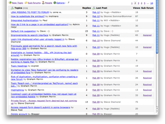
Mixed View seems to have an excess of white space at left hand side:


In comparison, Topics view makes better use of space:

Is there a reason for the white space in Mixed View? Might it be reduced a little?
Aiming for best use of available space, especially when fora are embedded.
Thanks
Graham