Forum Layout
|
My forum has two separate interests. One is for men. The second is for women.
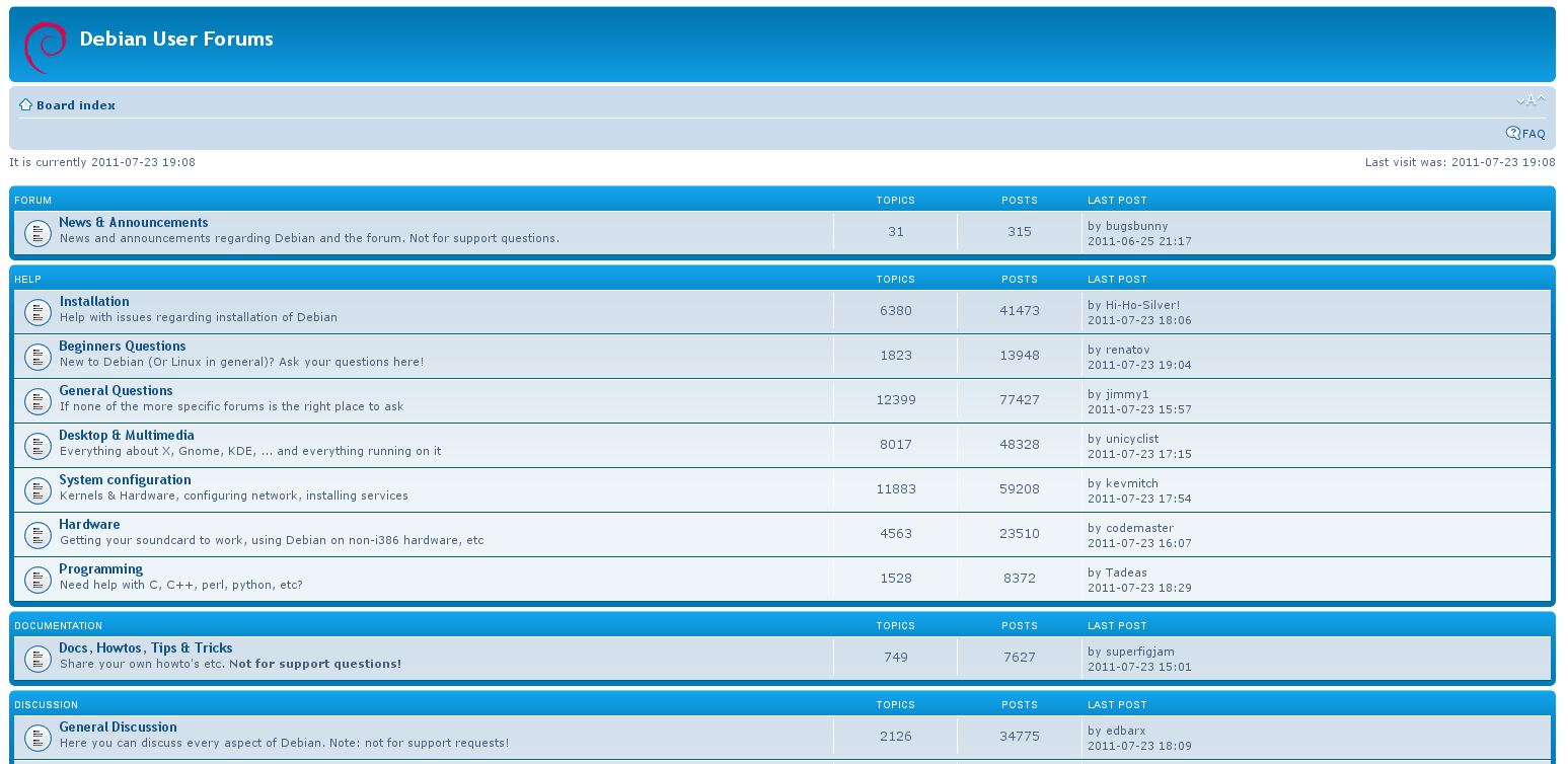
I need them separate boxes. The men's box will have men related issues. The women's box will have woman's issues. I want a blank space between the men's box and the woman's box. There must be a simple solution that I'm missing. I'm only using this image as an example.  Anyone have suggestions? Thanks in advance! |
|
Your image of a totally unrelated forum, from a different provider only serves to confuse, especially as it has many more areas than the two you say you want.
Set up your Nabble forum with two sub-forums for your two areas of interest. Then post a few dummy messages to each area, then post the URL of your forum and with a full description of how you want it to appear differently (with annotated images if necessary), then we have a chance of helping you.
Volunteer Helper - but recommending that users move off the platform!
Once the admin for GregHelp now deleted. |
|
Thanks for your response! I certainly didn't mean to confuse the issue by posting another provider's board. However, that's the same structure I see on every forum on the Internet.
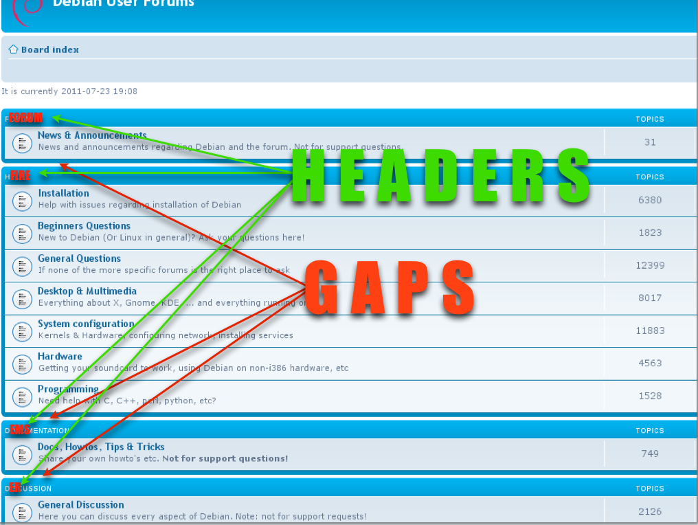
I have three subjects. One is for Firefighters. The second is for EMS. And, the third is for ER Personnel. I want them in defined sections with space between the "Headers." My resolution thus far is to create 3 separate forums, each for the three subjects and put a different HTML code on only one page. This way the navigation buttons create the "space" between them. Problem is that the user needs to enter the same keyword in in all three to find a post on one subject. If anyone knows how to do this, please respond. Equally, if Nabble just doesn't have this feature…I can disappointedly cease my efforts. Other than that, I really enjoy Nabble. |
|
Hi
Then, as I said in my previous response, you should create a forum and then three sub-forums to contain each of the general subject areas. I am not clear what you mean by "spaces between the headers". Until you have created your three sub-forums, and experimented with the various applications types that Nabble offers ("Forum", "Board", "Mixed" and "Category" are likely to be the best options for you) for the top level forum with their various standard layouts it's difficult to know what you have experimented with and how that differs from what you have in mind. It will be best if you create the three sub-forums, experiment with the application types, then post the URL of your forum here, (already embedded if you so wish) so you can describe how you wish to change things. Definitely, the wrong approach... ... for this reason alone!
Volunteer Helper - but recommending that users move off the platform!
Once the admin for GregHelp now deleted. |
|
Anyone who's still confused, please refer to this diagram. It looks like every forum I've ever seen. I deeply apologize that my example isn't a Nabble product.
If you do understand the "Gaps" and "Headers" concept and know how I accomplish this seemingly simple task, I'd like to thank you in advance! I've tried everything. If this is impossible and you let me know, that's equally helpful. Again, thank you. 
|
I understand your frustration and there's no need to apologise that you are not showing a Nabble product, but it does produce significant problems when attempting to advise you. This is because Nabble has a large range of options in its basic display (referred to as "Applications" in Nabble jargon) - consequentially it is not like "like every forum you've ever seen" and none has a default format exactly like those of other forum providers. Each of these applications calls slightly different macros within Nabble's code in order to achieve their appearance. That is why it is necessary to show us your chosen application, by posting its URL. Then we know which macros need to be adjusted and can advise you appropriately. To achieve exactly what you want may require either edits to the NAML code that generates the forum or customised CSS code. Both of these actions can be done by forum owners, so again, Nabble is not "like every forum you've ever seen" as Nabble offers considerably more flexibility than any other forum I've ever seen. So, I say again, don't assume that all forums are the same. They aren't! Post the URL of your Nabble forum, tell us why you've picked the application you have as your starting point and what you want to achieve with it. One has to ask, why are you even considering Nabble if other forum providers appear to offer exactly what you want without difficulty? I guess they are missing something from your ideal too. Do explain what then we'll be in a still better position to help. To demonstrate the ways in which Nabble might be different to those forums you've previously tried, take a look at these two: http://www.gregafloat.plus.com/blog/index.html http://www.seahawk17.plus.com/forum.htm
Volunteer Helper - but recommending that users move off the platform!
Once the admin for GregHelp now deleted. |
|
I really like Nabble for the same reasons you mentioned. I also like the way it fits and works inside HTML5 websites…something I couldn't find with any competitor. However, you've convinced me that Nabble is just not for me. Thanks, I really do appreciate your help.
On Tue, Jan 21, 2014 at 6:25 AM, GregChapman [via Nabble Support] <[hidden email]> wrote: I understand your frustration and there's no need to apologise that you are not showing a Nabble product, but it does produce significant problems when attempting to advise you. |
|
In reply to this post by GregChapman
Here's the URL.
http://massivetotal.wix.com/onlinestationhouse I certainly hope this helps! Can't wait to hear suggestions. |
|
I see you've been working hard over the weekend and now have a number of sub-forums in place, so that users only need to register once on your site to gain access to any of your sub-forums. That has got to be the best approach.
I've also been doing a little technical research and reminding myself of how the various sub-forums, and most recently active topics, are presented. The HTML which is generated by Nabble's NAML code places the main body of content within a single table with no distinctive class names on which to hang styling code that would allow you to separate the areas in quite the way you first requested. So I have concluded that to produce the effect you originally wanted is not easily achieved and will need some expertise in NAML coding to produce. As you ask for suggestions... Looking at your site now, I believe you have selected a "Mixed" application for the top level. Without registering I can't confirm whether your permissions are set up optimally for that application. If you haven't already, I recommend you register a second address so you can test how the various permissions you have set work for a regular user. For example, you should prevent all users from posting at the top level and then allow posting on each appropriate sub-forum. Then when someone then attempts to use the "New Topic" link at the head of the forum they are offered a list of appropriate areas in which they may post. Do you plan to take advantage of the "Members" group so you can distinguish between members of the public and service personnel and grant each different access for relevant areas - particularly to the "Seeking Jobs - Hiring Staff" area? At the moment, you seem to have merged the FIRE STATION, EMS STATION and ER STATION areas that you originally wanted into one area. I assumed you'd want each to be a separate sub-forum. Conversely, I'm surprised by the separation of "OnlineStationHouse Rules!" and "Welcome! Let's get you started", which both seem to belong in a single "Housekeeping/Introductory" section. Given the images in your original posts, I think you might find that the "Category" applications are more suitable than "Mixed" as it is designed to show the descriptions of the various sub-forums, with none of the topics showing. "Board" is similar, but this also quotes from topics within the sub-forums. On usability grounds, I find the site a little heavy on large graphics at the moment. It tends to mean a lot of scrolling is necessary before you find any real content. This is particularly noticeable if you are using a phone or tablets. Hope that's enough thoughts to keep you going! :-)
Volunteer Helper - but recommending that users move off the platform!
Once the admin for GregHelp now deleted. |
|
Thanks for your input! I agree on the heavy graphics but we're going against some giant websites with seemingly unending art resources. Our only asset is that we combine everyone who would work a plane crash, together. None do that, yet. So, as much as we want to be different, we don't want to be the "most plain looking person going to the prom." The heaviness of copy on the site is for SEO purposes. Applying a Nabble forums into the main site means the majority of the SEO will point to http://onlinestationhouse.55968.x6.nabble.com and not OnlineStationHouse.com. That needed to be address, so we intended to find a happy medium. We also understand many will mark our forums and not the main page...but we needed some SEO copy presence for web crawlers.
Ultimately, emergency services is a very tight community. Depending on someone else for life and heathy returns can bring people together with immense bonding. The ONLY way this community grows roots is through word-of-mouth.
Thanks for your input and I look forward to any advice you can offer. "Thank your ER, hug your fireman and kiss your EMS!"
On Tue, Jan 28, 2014 at 4:38 PM, GregChapman [via Nabble Support] <[hidden email]> wrote: I see you've been working hard over the weekend and now have a number of sub-forums in place, so that users only need to register once on your site to gain access to any of your sub-forums. That has got to be the best approach. |
«
Return to Free Support
|
1 view|%1 views
| Free forum by Nabble | Edit this page |

