Adverts are bunched up...

classic Classic list List threaded Threaded
17 messages Options
Reply | Threaded
Open this post in threaded view
|

Adverts are bunched up...

mywaytoo
Latest advert issue... They are bunched up within the posts... If I was paying for that advert, I would be furious!

nabble ad soooo bunched up


Anne
Reply | Threaded
Open this post in threaded view
|

Re: Adverts are bunched up...

mywaytoo
No comment then???
Anne
Reply | Threaded
Open this post in threaded view
|

Re: Adverts are bunched up...

Peter <Nabble>
Anne, this is not an issue. We placed them there.
Nabble staff. We never ask for passwords.
Reply | Threaded
Open this post in threaded view
|

Re: Adverts are bunched up...

mywaytoo
This looks really stupid... 

It shows a 'we don't care about details' attitude... Just hope that people realise that it's nabble's software... and not my choice!

Anne
Reply | Threaded
Open this post in threaded view
|

Re: Adverts are bunched up...

Peter <Nabble>
What do you mean? which details?
Nabble staff. We never ask for passwords.
Reply | Threaded
Open this post in threaded view
|

Re: Adverts are bunched up...

Harvey
This post was updated on .
In reply to this post by mywaytoo
Mywaytoo  - can you post a link to the precise page where the ad is bunched?  I couldn't find it, and I'd like to see what you are talking about. The image above is small (for my old man eyes anyway!).

Peter - I think what she is saying is that if the ads are presented in a format that is not ideal, it brings the user experience of the site down. Users don't make a distinction in their mind about who is responsible for what part of the page.

I have a feeling that the 728 x 90 ad unit needs a minimum width of ??? to display properly.
HTTPS Please!
Reply | Threaded
Open this post in threaded view
|

Re: Adverts are bunched up...

Peter <Nabble>
By bunched you mean it's not centered? Just now I realized it is not centered in your print. Sorry.

Please, provide a link to it so we can check and fix it.
Nabble staff. We never ask for passwords.
Reply | Threaded
Open this post in threaded view
|

Re: Adverts are bunched up...

mywaytoo
http://knit4dolls-blog-and-forum.977845.n3.nabble.com/Where-to-buy-your-knitting-yarn-td3413580.html

By bunched up I mean following to closely. The advert is sitting directly on top of my post. I would put 2 blank lines between the ad and my following post. See the spacings that I've used above the advert...

But hey... Up to you!


Anne
Reply | Threaded
Open this post in threaded view
|

Re: Adverts are bunched up...

GregChapman
Maybe things have changed , but right now it looks nicely spaced to me.

In the image below I have darkened the grey border to your posts (but not the ad) so you can easily see where things begin and end.
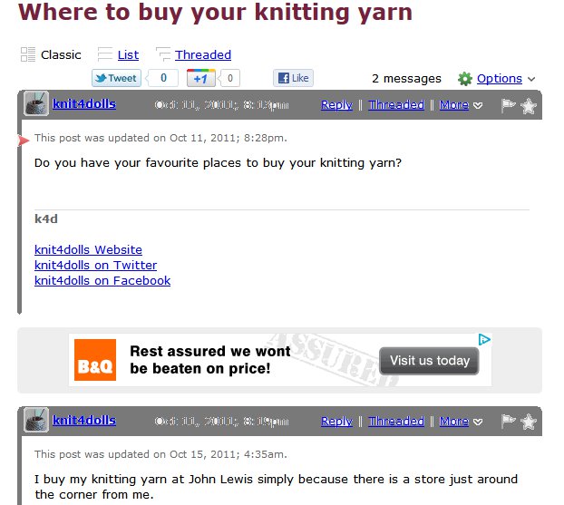
Knit4You ad

BTW, are you aware that, at your present rate of visits to the forum, for around £2.50 you can clear the ads for the next 5 years. At that price surely it is worth it? I recognise you feel aggrieved about the way they were introduced, but your messages about the adverts and forum software projects an image of someone who is both embittered and not in complete control of their web site. Won't such an image leave potential customers wondering both how you might handle them as customers and the confidence you have in your suppliers, something of equal concern to the service they get from you.
Volunteer Helper - but recommending that users move off the platform!
Once the admin for GregHelp now deleted.
Reply | Threaded
Open this post in threaded view
|

Re: Adverts are bunched up...

Peter <Nabble>
Greg, this issue is happening on Internet Explorer.
Nabble staff. We never ask for passwords.
Reply | Threaded
Open this post in threaded view
|

Re: Adverts are bunched up...

Harvey
Looks ok in firefox, safari and chrome (on a mac):

HTTPS Please!
Reply | Threaded
Open this post in threaded view
|

Re: Adverts are bunched up...

GregChapman
This post was updated on .
In reply to this post by Peter <Nabble>
Ah yes! Forgot that MyWayToo uses that!

It appears that the advert drops out of its background box losing the centring and you leaving an empty redundant bar above it - not to mention the loss of the nice rounded corners on that you see on many web sites these days. (Who'd want to continue to use IE?  )

Advert format error
Volunteer Helper - but recommending that users move off the platform!
Once the admin for GregHelp now deleted.
Reply | Threaded
Open this post in threaded view
|

Re: Adverts are bunched up...

mywaytoo
This post was updated on .
nabble ads bunching

And another advert............................. BUT................

Compare how I see my forum, with what Greg sees..................
I see light grey bars............. Greg sees dark grey bars...... WHY IS THIS?


Oh... I gave up looking at Volusion ages and ages ago................

Edit: The adverts look OK if the post is the only one there... once there is a reply, then the positioning is BAD...

Anne
Reply | Threaded
Open this post in threaded view
|

Re: Adverts are bunched up...

Peter <Nabble>
Anne, Greg painted that on an image editor (guessing Paint) just to give it more contrast so he can better explain what he is seeing. Don't worry, we see as you do: very light grey.

We are still fixing it.
Nabble staff. We never ask for passwords.
Reply | Threaded
Open this post in threaded view
|

Re: Adverts are bunched up...

GregChapman
Peter <Nabble> wrote
(guessing Paint)
Good try! Correct answer: The GIMP!
Volunteer Helper - but recommending that users move off the platform!
Once the admin for GregHelp now deleted.
Reply | Threaded
Open this post in threaded view
|

Re: Adverts are bunched up...

mywaytoo
Greg... Please don't show my website / forum etc, in any way except that which I have selected. I realise that you are trying to help, but please don't do it! Thank you.
Anne
Reply | Threaded
Open this post in threaded view
|

Re: Adverts are bunched up...

Peter <Nabble>
This was fixed.
Thank you Anne, for spotting this one.
Nabble staff. We never ask for passwords.