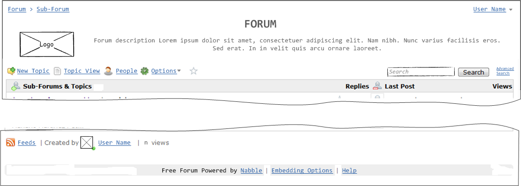
I would like to suggest a slight re-design in the Nabble header and Footer.
The header height can be a little smaller so it looks even better when embedded. This can be done simply by removing some whitespace i.e.;
- move the search box down to the same level as the "New Topic"
- when the logo is on the left/right the description should be next to it (now it seems to be more on the side under the description)
.... and I would like to see the "Embedding Options" moved to the bottom of the forum because it only adds confusion when the forum is already embedded.
See current and new screen mock-ups below. Any thoughts?
Current Nabble:
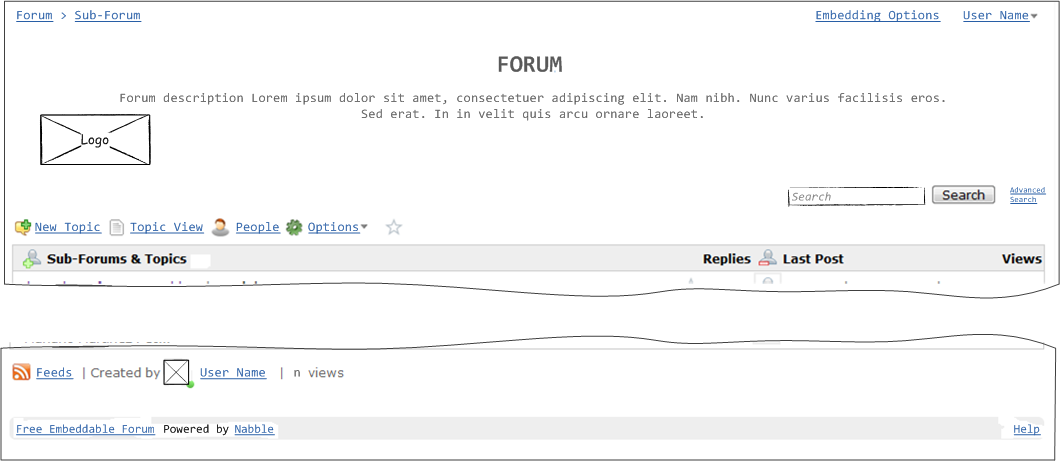 New Nabble suggestion: