Mobile-friendly Nabble
12
12
|
Hi Pedro,
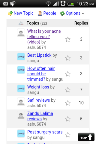
I am aware of Mobile version of Nabble. I was wondering if it can be made more friendly by removing last posts and number of replies in the mobile version only. Thereby user can see only questions so it be more spacious. Thank you, Regards, Priyanka |
|
We can get something like this using JavaScript and css approach. Override your "standard_table_columns" macro like this:
<override_macro name="standard_table_columns" requires="app_namespace">
    <script>
        $(document).ready(function() {
        if (jQuery.browser.mobile) {
        $("tr.main-row td:nth-child(6)").css("display","none");
        $("tr.header-row td:nth-child(6)").css("display","none");
        $("tr.main-row td:nth-child(7)").css("display","none");
        $("tr.header-row td:nth-child(7)").css("display","none");
        }
        });
    </script>
    <n.pin_column/>
    <n.topics_column title="[n.standard_topics_column_title/]" count="[n.page_node.child_count/]"/>
    <n.star_column/>
    <n.replies_column/>
    <n.last_post_column has_avatar_control="yes" white_space="nowrap"/>
    <n.views_column/>
</override_macro>
My test forum.
|
|
Hi Pedro,
That worked.It looks neat in the mobile version with questions and replies! You are awesome Pedro  Thanks a ton! |
Can you provide a screencap so I can see what this looks like? Would this help mobile viewing on a page that is embedded?
HTTPS Please!
|
|
Hi Harvey,
I am attaching the snapshot. It looks nice and compact now. Regards, Priyanka 
|
|
In reply to this post by Pedro
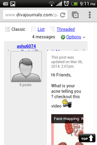
 Hi Pedro, I just attached screenshot of the post. This is mobile version screeenshot. The "reply" buttons etc are clearly not visible. How to set it right? Also how to make embedded videos mobile friendly? Regards, Priyanka |
|
Please, replace your override with this:
<override_macro name="standard_table_columns" requires="app_namespace">
    <script>
        $(document).ready(function() {
        if (jQuery.browser.mobile) {
        $("tr.main-row td:nth-child(4)").css("display","none");
        $("tr.header-row td:nth-child(4)").css("display","none");
        $("tr.main-row td:nth-child(5)").css("display","none");
        $("tr.header-row td:nth-child(5)").css("display","none");
        }
        });
    </script>
    <n.pin_column/>
    <n.topics_column title="[n.standard_topics_column_title/]" count="[n.page_node.child_count/]"/>
    <n.replies_column/>
    <n.last_post_column white_space="nowrap"/>
    <n.views_column/>
</override_macro>
My test forum.
|
|
Hi Pedro,
Still the same,no changes |
|
That was for changing another thing.
Please, try to set your css, probably understand how your site is treating mobile layout, in a way to make it comfortable on your device. Other forums can be viewed well.
My test forum.
|
|
Pedro what do you mean by set your css?
What exactly should I do? I tried but the reply buttons cannot be seen. The main screen is fine. |
|
You site http://www.divajournals.com deals with mobile in a way that "crash" Nabble's style.
You could see how it works and try to find a way to make Nabble shows wider. The reply button can't be seem because the forum has been compressed to fit inside the mobile version of your site.
My test forum.
|
|
So what do you suggest Pedro?How should I go about it?
|
|
Let me know if it gets better after heading resize.
My test forum.
|
|
No Pedro the mobile version still looks the same like the picture I attached above.
|
|
This post was updated on .
In reply to this post by Pedro
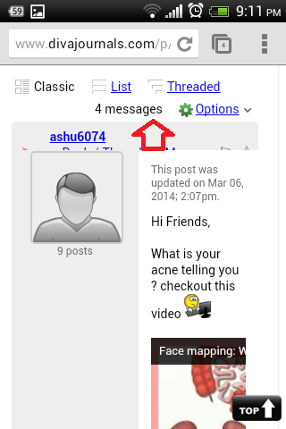
 Pedro how about increase the header space( marked with red arrow)? May be then reply buttons can be seen. This is only with respect to mobile version. |
|
I tested many things but haven't made a good solution yet. What do you think of put the menu options below the avatar for mobile devices.
Please, see this topic in your cellphone: http://pedro-3.1104361.n5.nabble.com/registered-td64.html
My test forum.
|
|
Pedro actually this is more of a better fit for mobiles.
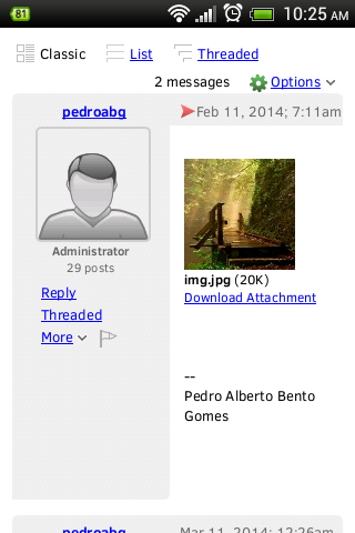
So how do I go about it ? Here I am attaching a screenshot. 
|
|
The idea is show this style only on mobiles.
What do you want? The menu under the avatar only for mobile or on pc and mobile?
My test forum.
|
|
Yes Pedro mobile version only..
|
|
Please, use this override for now, until I find a better solution.
<override_macro name="classic_row_with_big_avatar" requires="node, node_list">
<script type="text/javascript">
$(document).ready(function() {
if (jQuery.browser.mobile) {
$(".classic-right-menu").css("display","none");
$(".mob-menu").css("display","block");
}
});
</script>
<div class="classic-row">
<div class="classic-header">
<div class="classic-bar shaded-bg-color rounded-top">
<div class="classic-author-name nowrap">
<n.owner.user_link/>
</div>
<div class="classic-right-menu shaded-bg-color weak-color" >
<n.reply_link/> |
<n.threaded_link/> |
<n.post_dropdown/>
<n.report_flag/>
</div>
<div class="classic-subject-line">
<n.red_arrow_icon/>
<n.classic_post_date/>
<n.classic_subject_line/>
</div>
</div>
</div>
<table class="classic-body">
<tr>
<td class="classic-author shaded-bg-color rounded-bottom">
<n.classic_big_avatar_cell/>
<div id="mob-menu" class="mob-menu" style="text-align: left; line-height: 20px; margin: 5px 25px; display:none;">
<n.reply_link/><br/>
<n.threaded_link/><br/>
<div class="menu_spot"></div>
<n.post_dropdown/>
<n.report_flag/>
</div>
</td>
<td class="classic-message">
<n.classic_message_cell/>
</td>
</tr>
</table>
</div>
</override_macro>
My test forum.
|
«
Return to Nabble Support
|
1 view|%1 views
| Free forum by Nabble | Edit this page |

